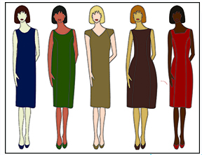
The Relative Lightness and Darkness of the Color Combinations
In the last post you learned that color combinations are just like the “Three Bears.” Some are overpowering (too hard). Others are blah (too soft) and a few are just right.
The relative lightness and darkness of those colors
You discovered what other colors on the color wheel you can wear with your base color.
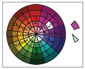
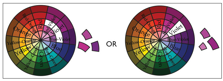
An example of medium color contrast profile and light and medium color combinations is violet on the third ring of the value color wheel goes with a light blue-green on the inner ring.
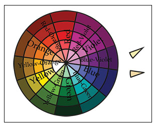
Or you can wear colors on the same level, like light yellow with light yellow orange.
Or you can wear a large mix of light and dark colors. For example, violet on the third ring of the value color wheel goes with a green on the outside ring of the same wheel and orange on the inside ring.
In this post you will learn about:
The clue your Color Contrast Profile gives you as to the relative lightness and darkness of colors
Combining color combinations: other colors with their relative lightness and darkness
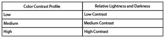
Color Contrast Profile Clue
In the last post you discovered your color contrast profile. You determined the contrast between your skin, hair and eyes:
Low
Medium
High
If you need to review or didn’t previously determine your color contrast profile go to “The Three Bears” of Color Combinations.
To determine the relative lightness and darkness of color combinations you can wear, you also look to your color contrast profile. If you are:
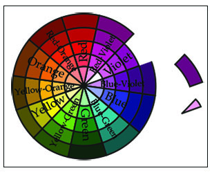
Being low contrast means that you stay on the same ring of the intensity or value as your base color on the value color wheel when choosing a different color; or one ring below or one ring above when choosing the same color.
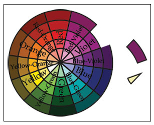
Being medium contrast means you can move two or three rings above or below your base color ring.
Being high contrast means you can combine any ring on the intensity or value color wheel.
Putting Your Color Combinations Together
You may ask: How do I combine colors based on:
Other colors on the color wheel, and
The relative lightness and darkness of those colors
When pairing colors together or color in prints, look for colors that match your color contrast. This includes both your base and neutral colors.
If you are low contrast, look for colors:
On either side of your base color but with the same level of intensity or value, or
Just one intensity or value above or below of the same color
If you are medium contrast, look for colors:
On either side/fourth color on either side, or
One or two rings above or below your base color ring
Finally if you are high contrast, look for colors:
Fourth color on either side/color on the opposite side, or
Three or more rings above or below your base color ring
Now you know what other colors you can pair with your base color and the relative intensity or value of those colors. When putting colors together tops and bottoms, clothes and accessories or prints, you know what color combinations will get everyone saying, “You look great” even if you don’t feel that great. In fact wearing the right colors will help you to start feeling better.
Now you know the relative lightness and darkness of colors. What is your low, medium or high contrast? Did this confirm something you already knew? Make comments below.